The Tibi Color Wheel, in 30 seconds
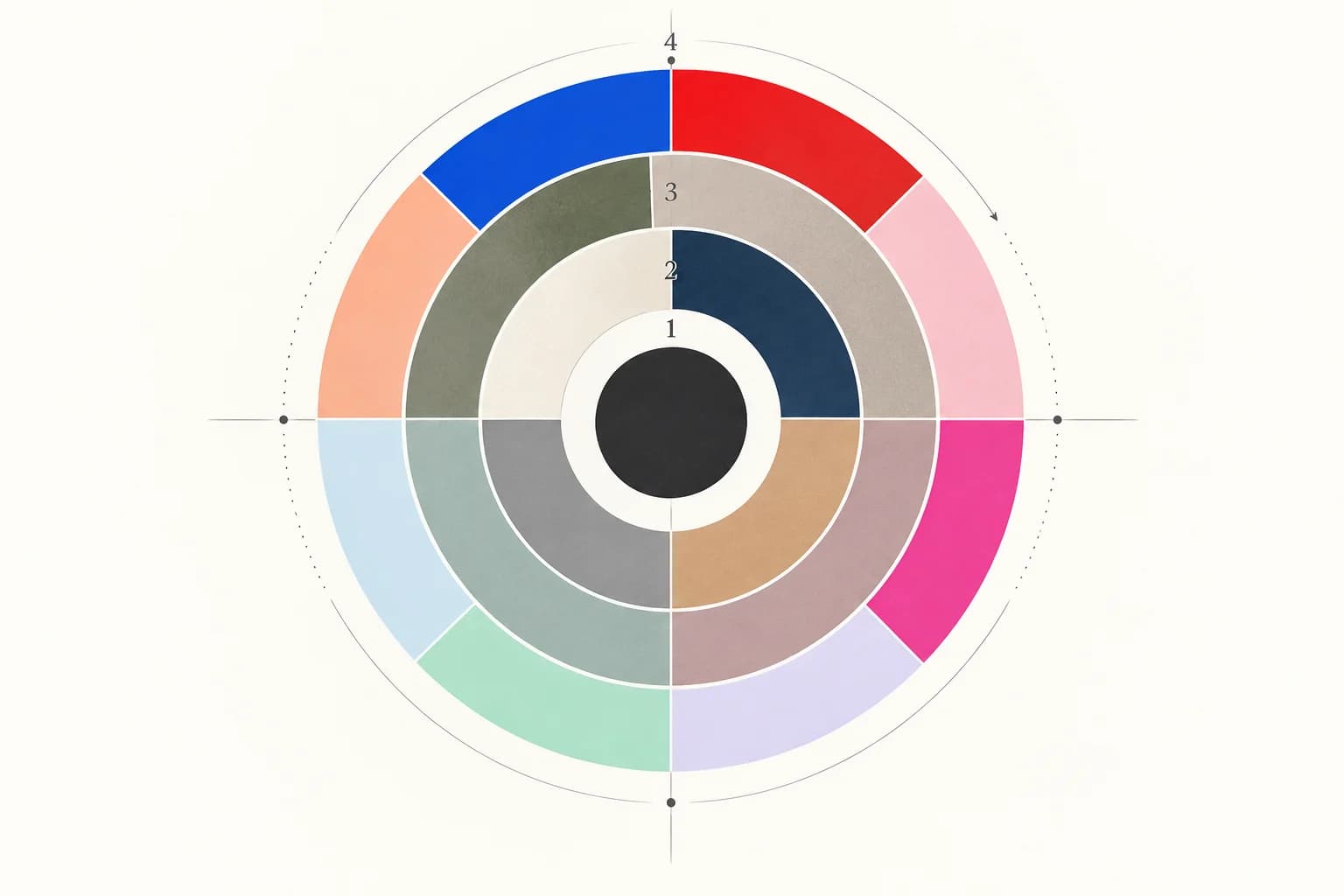
The Tibi Color Wheel is a styling framework developed by Tibi founder and creative director Amy Smilovic. Instead of asking only whether two hues are complementary, it asks what kind of energy each color contributes. Four rings move outward from black, through classic neutrals and nuanced “ish” shades, to expressive brights and pastels. As Tibi explains, choosing colors from rings that are farther apart generally creates a sharper statement.
That makes the system useful when a palette feels technically compatible but emotionally flat—or when a bright accent feels disconnected from everything around it. It is less a set of laws than a vocabulary for diagnosing the mood of a combination.
Why it is still in the conversation
The framework has travelled beyond Tibi’s own educational pages into current fashion coverage. Recent editors continue to use its language to explain nuanced Ring 3 neutrals and unexpected combinations such as olive with pink or chocolate with cherry. That staying power comes from a simple advantage: the system describes why a combination feels a certain way, not just which colors appear together.
How it differs from a traditional color wheel
A traditional color wheel maps hue relationships: complementary, analogous, triadic, and more. The Tibi framework maps styling roles. Two colors can sit near each other by hue yet occupy different energy rings; conversely, unrelated hues can behave similarly because they share the same muted or neutral character. Use the traditional wheel to understand hue harmony, and the Tibi wheel to reason about visual tension, calm, and emphasis.
The four rings explained
The HEX values below are ColorIndicator illustrations—not official Tibi specifications. They show how each role can translate to a screen.
Ring 1 · Black
The strongest anchor: graphic, decisive, and capable of sharpening nearly any palette.
Ring 2 · Classic neutrals
Familiar foundations such as ivory, navy, camel, and gray. Calm, reliable, and structural.
Ring 3 · Nuanced “ish” colors
Muted, grounded tones that resist a single obvious name and often work like new neutrals.
Ring 4 · Expressive color
High-energy color: saturated brights as well as light, unmistakable pastels.
Color math—but not a rigid equation
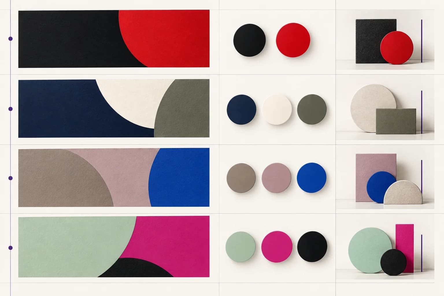
Tibi itself frames “color math” as a way to describe vibe and emotion, not a pass-or-fail formula. The useful principle is distance: nearby rings tend to feel quieter and more blended; distant rings tend to feel more graphic. The examples below are interpretations you can use as starting points.
| Combination | Typical energy | Illustrative use |
|---|---|---|
| Ring 1 + Ring 4 | Graphic and high contrast | Near black with vivid red or cobalt for a decisive focal point |
| Ring 2 + Ring 3 | Quiet and refined | Ink navy with olive gray for depth without visual noise |
| Ring 3 + Ring 4 | Creative but grounded | Mushroom or eucalyptus gray balancing a bright accent |
| Ring 2 + Ring 2 | Calm and classic | Ivory, navy, camel, and gray in a low-drama foundation |
| Ring 1 + Ring 2 + Ring 3 | Structured and nuanced | Black anchor, classic base, and one hard-to-name layer |
Three combinations to try now
1. Ink Navy + Olive Gray + Soft Ivory
#24324A + #7F806F + #F3EEE4 combines a Ring 2 structure with Ring 3 complexity. It feels composed and intelligent without depending on a loud accent.
2. Mushroom Brown + Cobalt
#8A776B + #2457F5 lets a nuanced base absorb some of cobalt’s intensity. The result is expressive, but the muted ground keeps it from feeling raw.
3. Fresh Mint + Fuchsia + Near Black
#82E0C0 + #D91B75 + #0A0A0A pairs two expressive colors with a Ring 1 anchor. Black supplies the edge that prevents the pastel-bright pairing from floating away.
From a wardrobe to a digital interface
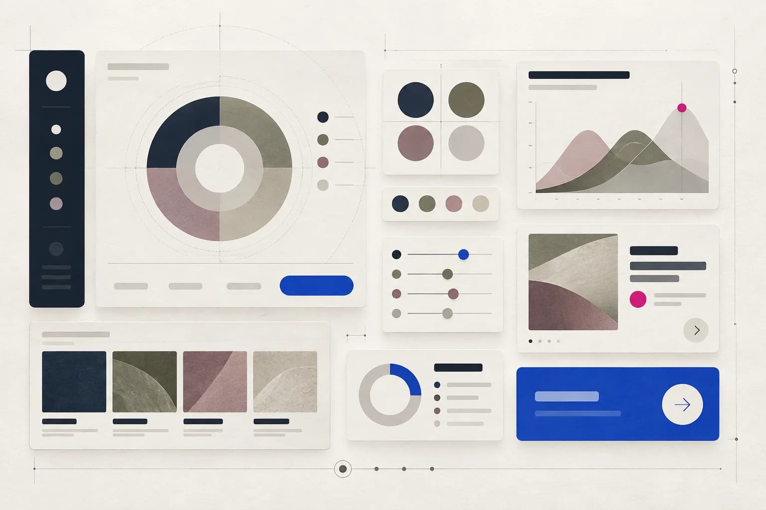
The same hierarchy can guide a digital palette if you translate rings into roles, not literal rules. Ring 2 colors can build backgrounds, surfaces, and body text. Ring 3 colors can distinguish secondary panels, data series, or quiet states. Ring 4 colors can signal one primary action or a small number of highlights. Ring 1 can provide the typographic or navigational anchor.
- Structure first: choose one or two Ring 2 neutrals for the interface foundation.
- Add character: use one Ring 3 color where a plain gray would feel generic.
- Spend energy deliberately: reserve Ring 4 for the action, state, or data point that deserves attention.
- Test, do not assume: ring placement says nothing about WCAG compliance; verify text and controls with the Contrast Checker.
How to use ColorIndicator with the framework
- Extract the real palette: upload a look, room, artwork, or interface to Image Analysis and identify its dominant colors.
- Inspect each color: open its color page to compare HEX, RGB, HSL, and nearby shades before assigning a ring role.
- Build hue harmony: use the Color Wheel when you also need complementary, analogous, or triadic relationships.
- Validate the final pairing: check text and UI contrast separately, especially when Ring 3 tones are used on similar neutral backgrounds.
The takeaway
The most useful lesson is not that every color must be placed perfectly. It is that color combinations have an energy structure. When a palette feels dull, add distance. When it feels harsh, introduce a Ring 2 or Ring 3 mediator. When it feels shapeless, add a black or near-black anchor. That is a practical way to turn “something feels off” into a decision you can test.
Sources and attribution
- Tibi — The Color Wheel, the official overview of the four rings and ring distance.
- Tibi — Color Math. But not really., the official explanation of the framework as vibe and emotion rather than rigid math.
- Marie Claire — Tibi Spring 2026 color combinations, recent editorial examples of the framework in practice.
- Who What Wear — Ring 3-inspired “unique neutrals”, recent coverage of the framework’s nuanced neutral category.
Editorial note: “Tibi” is a trademark of its respective owner. This independent educational guide is not affiliated with or endorsed by Tibi. The diagrams, sample HEX values, and digital-design applications on this page are original ColorIndicator illustrations.